Connect Us User Research
Interactive light projection on doors in a shared student accommodation in combination with an app to support easy communication.
ProjectUni projectDomainUX/UI DesignTimeframeFall Term 2022
How might we make it easy to communicate social needs in a shared flat in order to achieve a balance between social and alone-time?
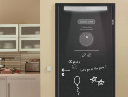
An interactive light projection on doors in a shared student accommodation in combination with an app to support easy communication. Flatmates can visually express their current social needs in order to achieve a balance between social and alone-time.
My involvement
I played a key role in innovating the concept idea. I worked as a Design Lead on creating the brand design, features and the user interface. And I led the UX design process.
Design Brief
This design brief is an invitation to think of new technologies that could:
„Support introvert practices and support extroverts to navigate in a world where introversion is the new normal.“
Interpretation
The initial step was to decide on a target group. This was done by brainstorming ideas together in the group on sticky notes. The target group that everyone agreed on was “Introverts who live in a shared accommodation”.
Interviews
An interview scheme was designed together in the group. The structure of the scheme began with demographic questions followed by main questions. The questions asked were related to the participant‘s living situation, interaction with flatmates and common problems that could occur on a daily basis.
Furthermore, a consent form was created for the participants to read and agree specific terms and conditions of the interview. The group interviewed eight participants with the open ended questions in order to gain a deeper understanding of their living situation. The interviews were conducted both physically in person and via Zoom. If the interview was conducted via Zoom, the interviewee had to read through and approve the given consent form, or possibly approve the recording of the interview orally.
The interviews were recorded to be able to focus on the participant and to be able to extend notes afterwards.
Affinity Diagram
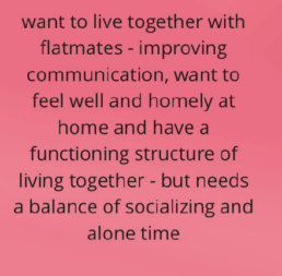
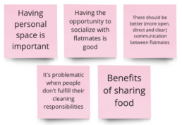
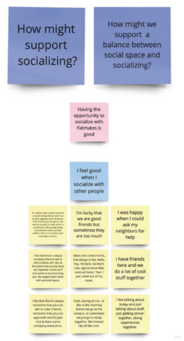
In the Define phase of the double diamond, an Affinity Diagram was created. The Affinity Diagram contained three levels of hierarchy. First, yellow notes with quotes from the interviews were created, some examples are “Sometimes people just entered our room without asking” and “I’m happy when I can ask my neighbors for help”. The second level of hierarchy presented the blue notes, in which the yellow notes were organized in related groups with an overarching explanation. Examples of blue notes are: “I would like to be alone more frequently in general” and “I get frustrated when it‘s messy and other people don‘t clean after themselves”. In the highest level, the key takeaways from grouped blue notes were written on pink notes.
Problem Statement
Based on the pink notes and the ‘How Might We?’ questions we ideated on the different solutions to the problems found. Each group member came up with different solutions which later were discussed together. From these ideas, we selected the one that we saw the greatest potential for further development by voting. We created the problem statement as follows: „An introverted flatmate living in a shared flat needs a way to easily communicate his/her social needs in order to achieve a balance between social and alone-time.“
Ideation
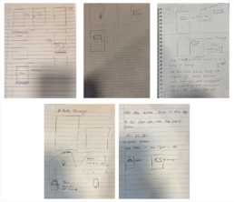
From the problem statement, everyone sketched with pen and paper what they believed the product should look like and stated the key features of the product.
After sketching, we came to the conclusion that the concept should be divided into two parts: a light projection on the door and an app that controls the projected image and text. A mood board was created in order to visualize and set a style for our project. A major source of inspiration for the projection was the Xperia Touch, which is a projector that is used as an interactive touchscreen.
Door
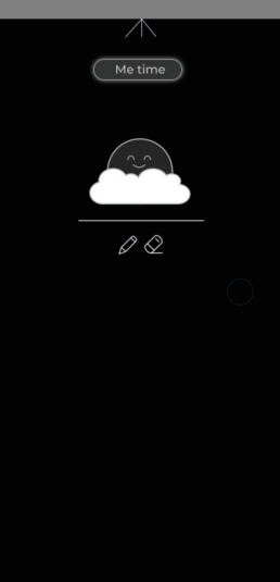
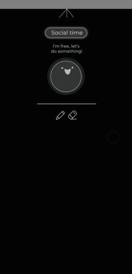
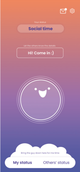
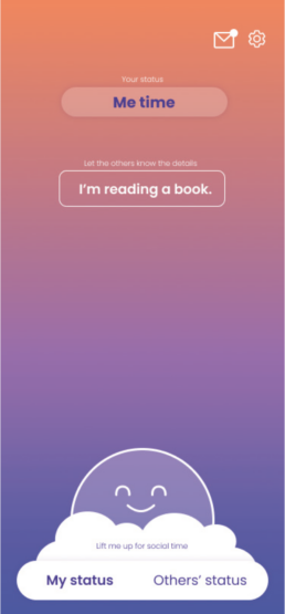
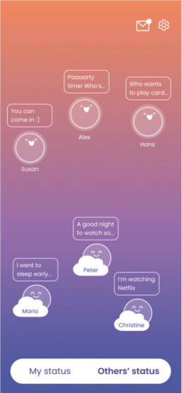
The ‘Develop‘ phase started with creating prototypes. We began developing the two product parts in Figma. After deciding on the overall concept and functionalities for both components, we went into greater detail and brainstormed ideas for our visual components. We also developed a mascot figure to assist users in expressing their desires for social and alone time. We used the same visuals for the projection and the app to maintain consistency. By making the projection interactive, we created a new way for flatmates to communicate with one another. Then, we selected a visual style that best reflected the mood we wanted our users to experience when using our product. With the product, we aim to create a safe environment in which everyone feels valued – allowing them to express their unique self more openly and freely. We used peaceful, minimalistic, and reassuring graphics and colors.
App
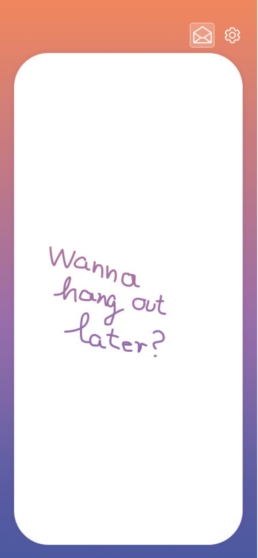
We prototyped the app by importing our screens from Figma into ProtoPie and adding the appropriate interactions. Switching between the desires of alone time or social time is the key component of our concept. Therefore, when designing the user experience, we placed a lot of emphasis on the particular interaction. We were able to develop a truly original swipe interaction that, while being modest and moderate, precisely illustrates the various emotions between the two moods.
Wizard of Oz, Think Aloud and Interview
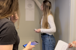
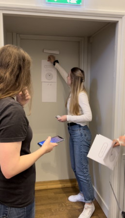
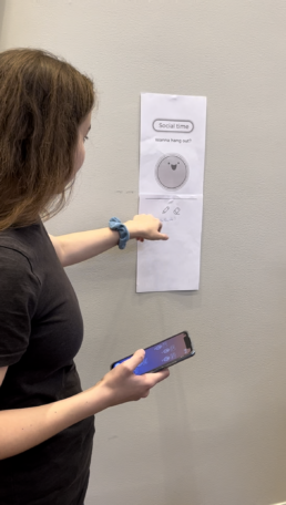
We conducted multiple user testing interviews using various evaluation methods. We began the tests by outlining a scenario in which the participant lives in a shared apartment with other students. To make the environment more natural for the participant, we simulated a corridor with two doors. One for the participant and another for her flatmate. The overall response was quite positive, particularly regarding the app‘s user experience. However, we found that we needed to improve the onboarding process because several functionalities were confusing to users in the beginning. Furthermore, we discovered that the projection on the door could be made more personalized by using different colors and images. In the future, we may include a chat option in the app, as well as the ability to send text directly to someone else‘s door from the app. We used our ready-built app prototype to test the app‘s user experience, but for the projection on the door, we employed ‘Wizard of Oz’ approach, substituting papers for the actual projection and manually changing them when the user made the right interaction in the controlling app. We employed the ‚Think Aloud‘ approach during the tests so that we could learn from the participant‘s thoughts and experience the friction points right away.
Project Team
Hanna Almqvist
Laila Arman
Mercedesz Hohmann
Christine Wolf

